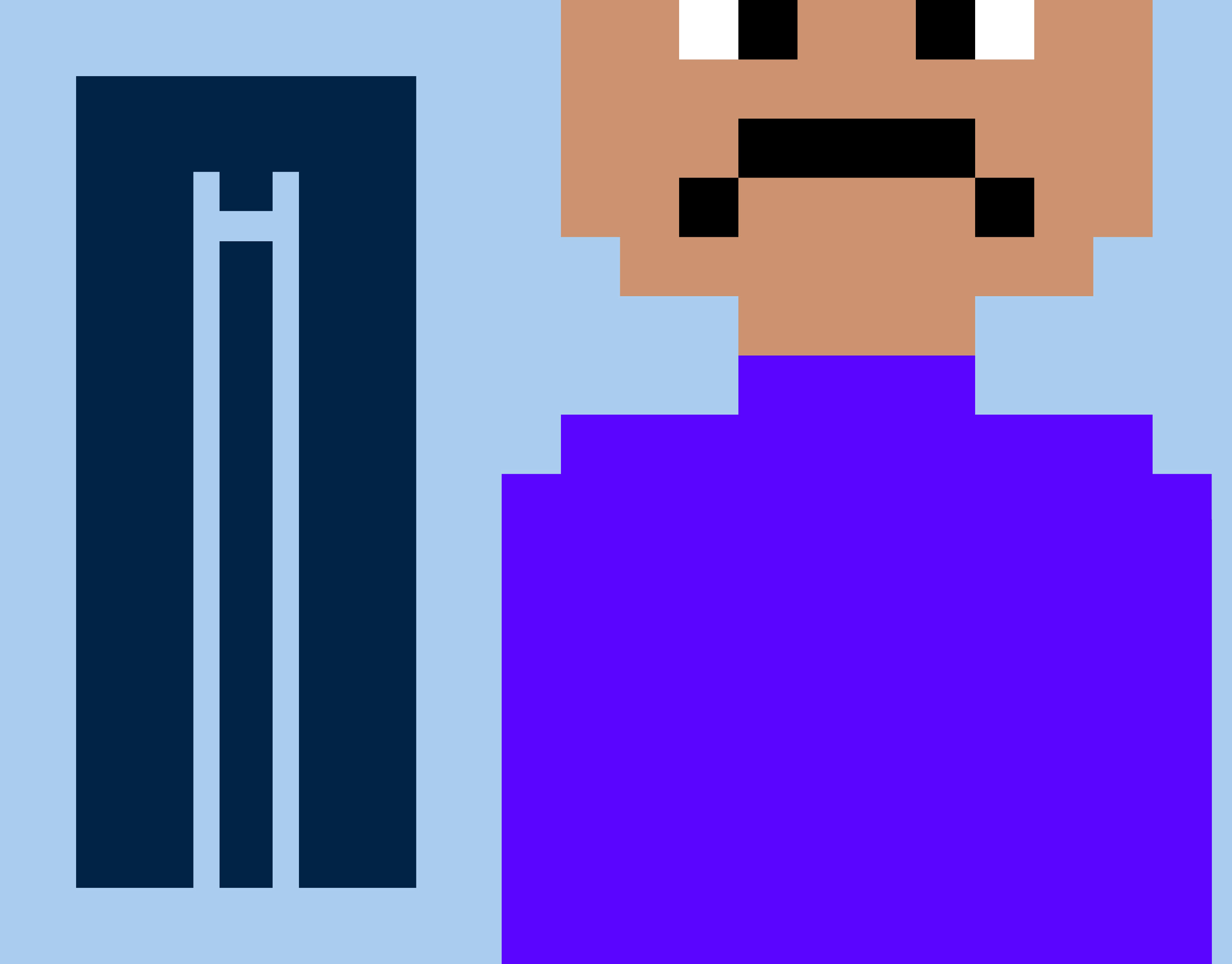
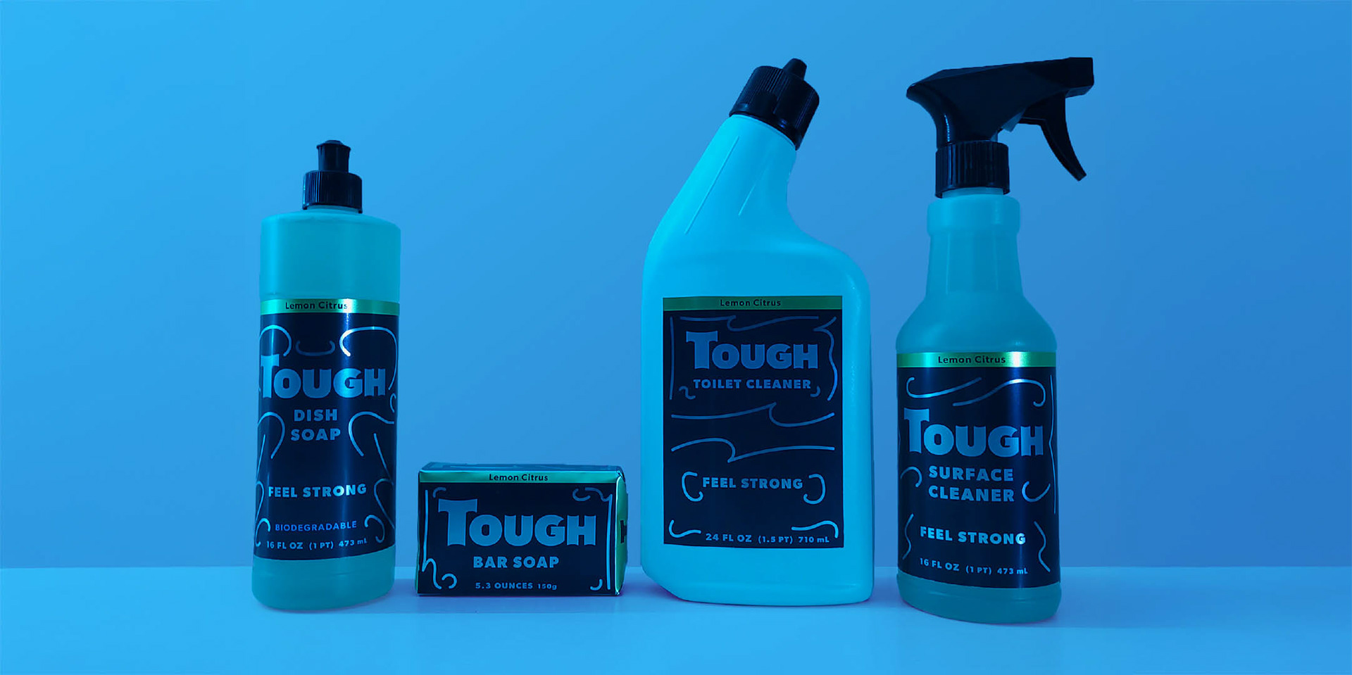
TOUGH
Deliverables:
Product Design, Brand Identity
Programs:
Illustrator
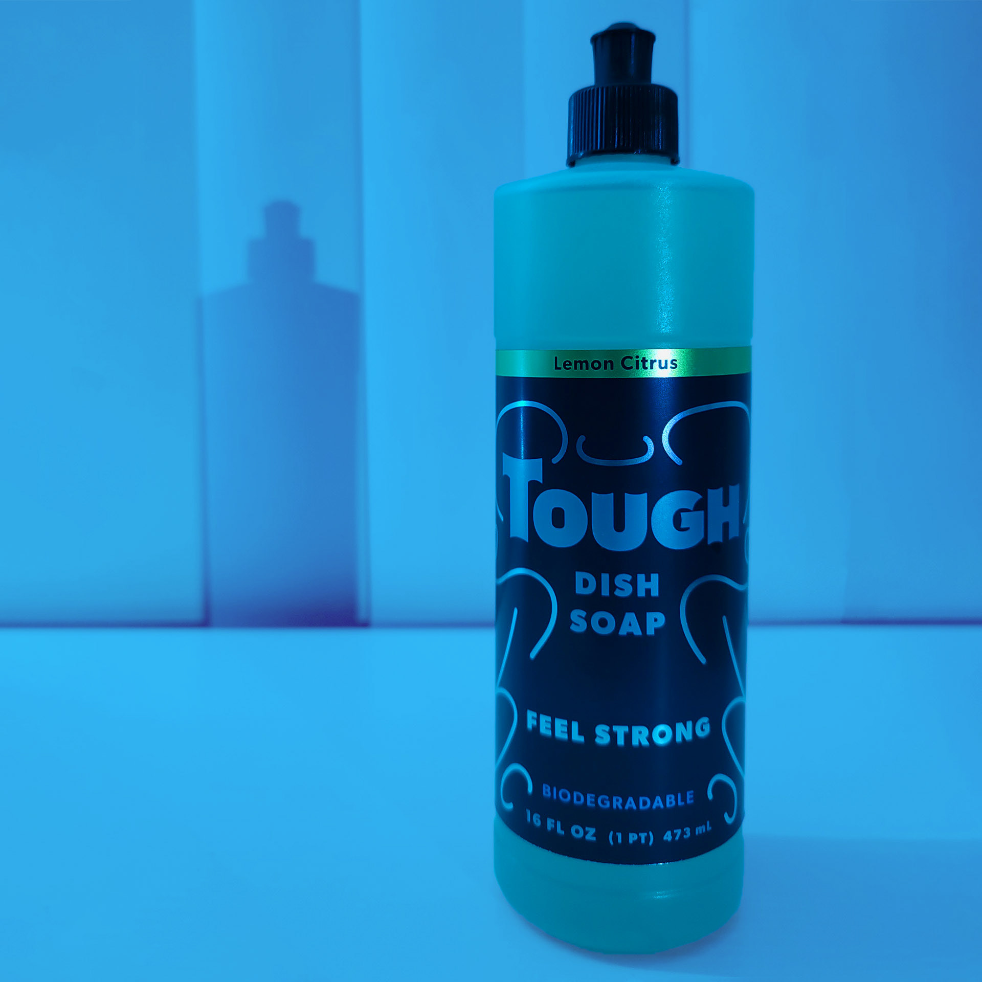
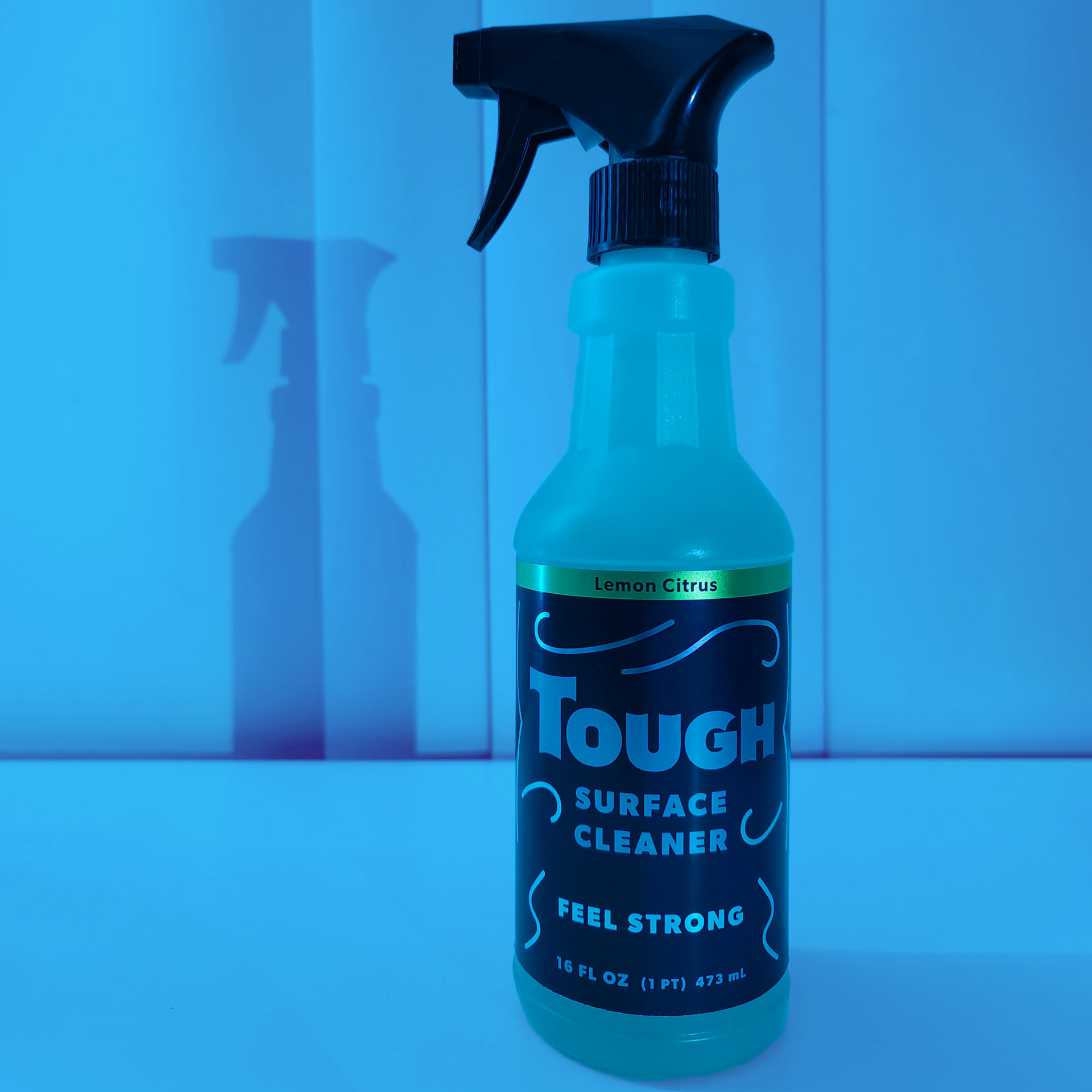
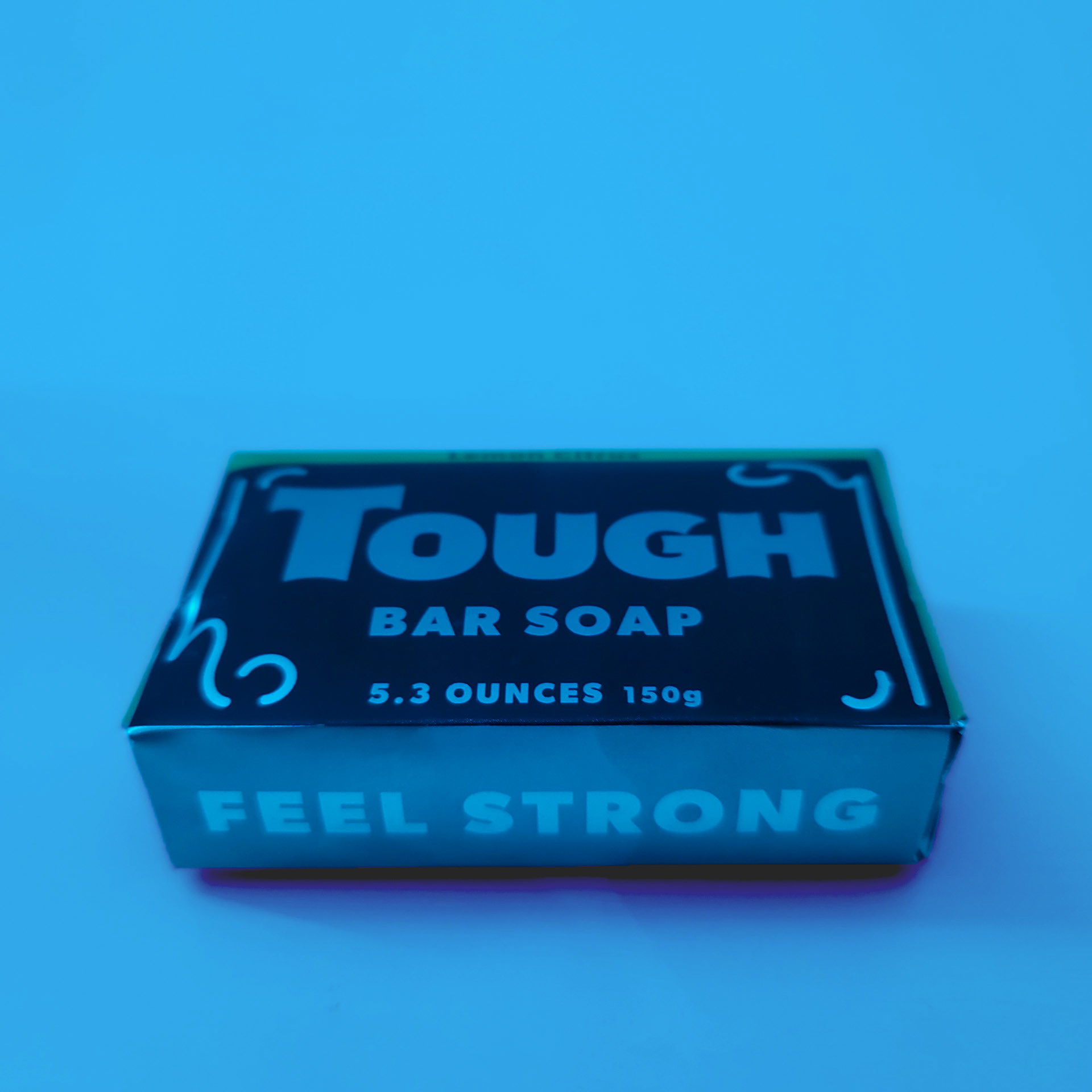
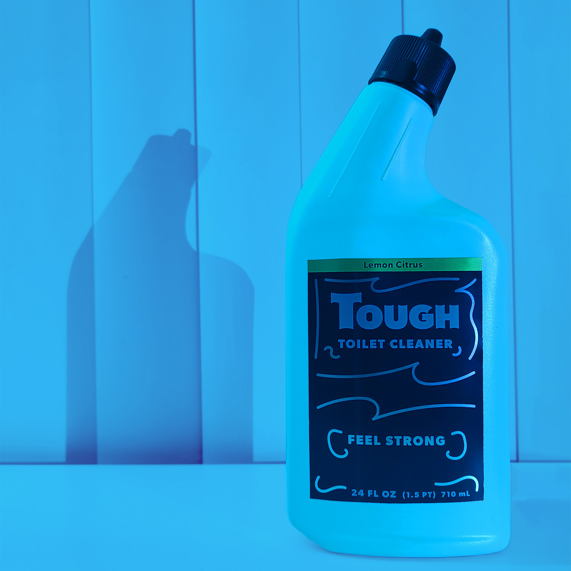
Cleaning products are often targetted towards women due to the common stereotype of women having to clean, but TOUGH is specifically aimed at men to reduce that stereotype.
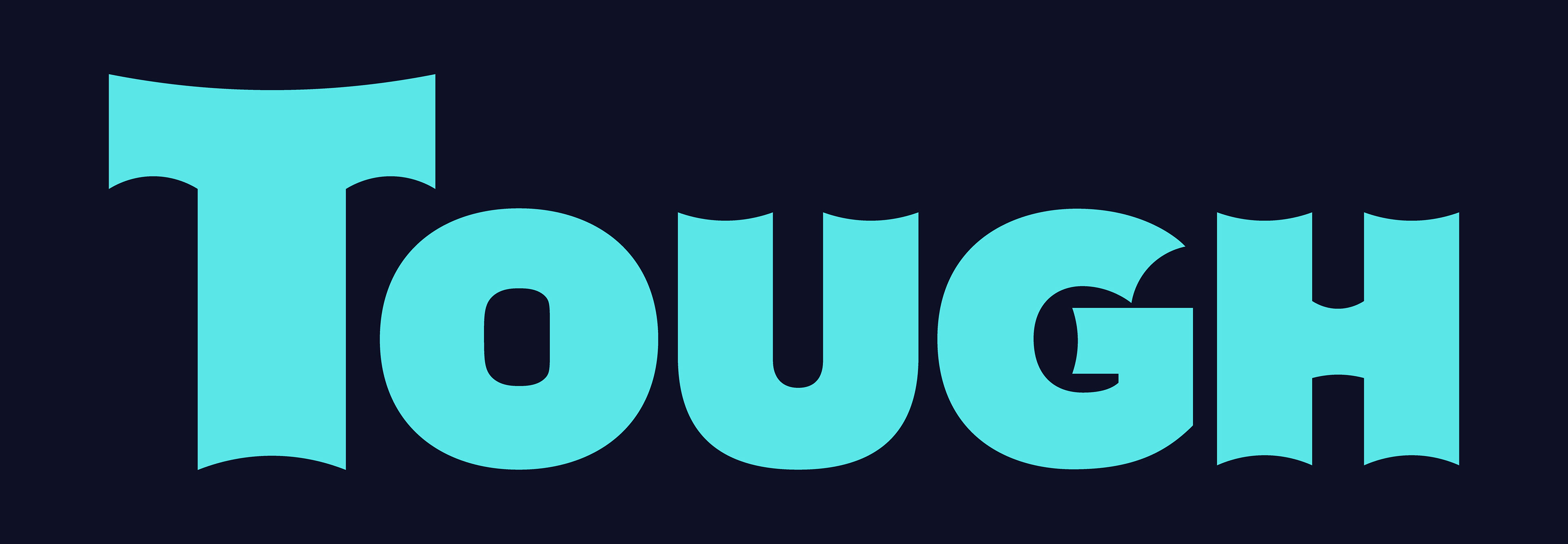
The logo is simple but easily recognizable from a distance as TOUGH, so you don't have to figure out what the product is for. The goal was to not go too far in the other direction to be overly masculine.
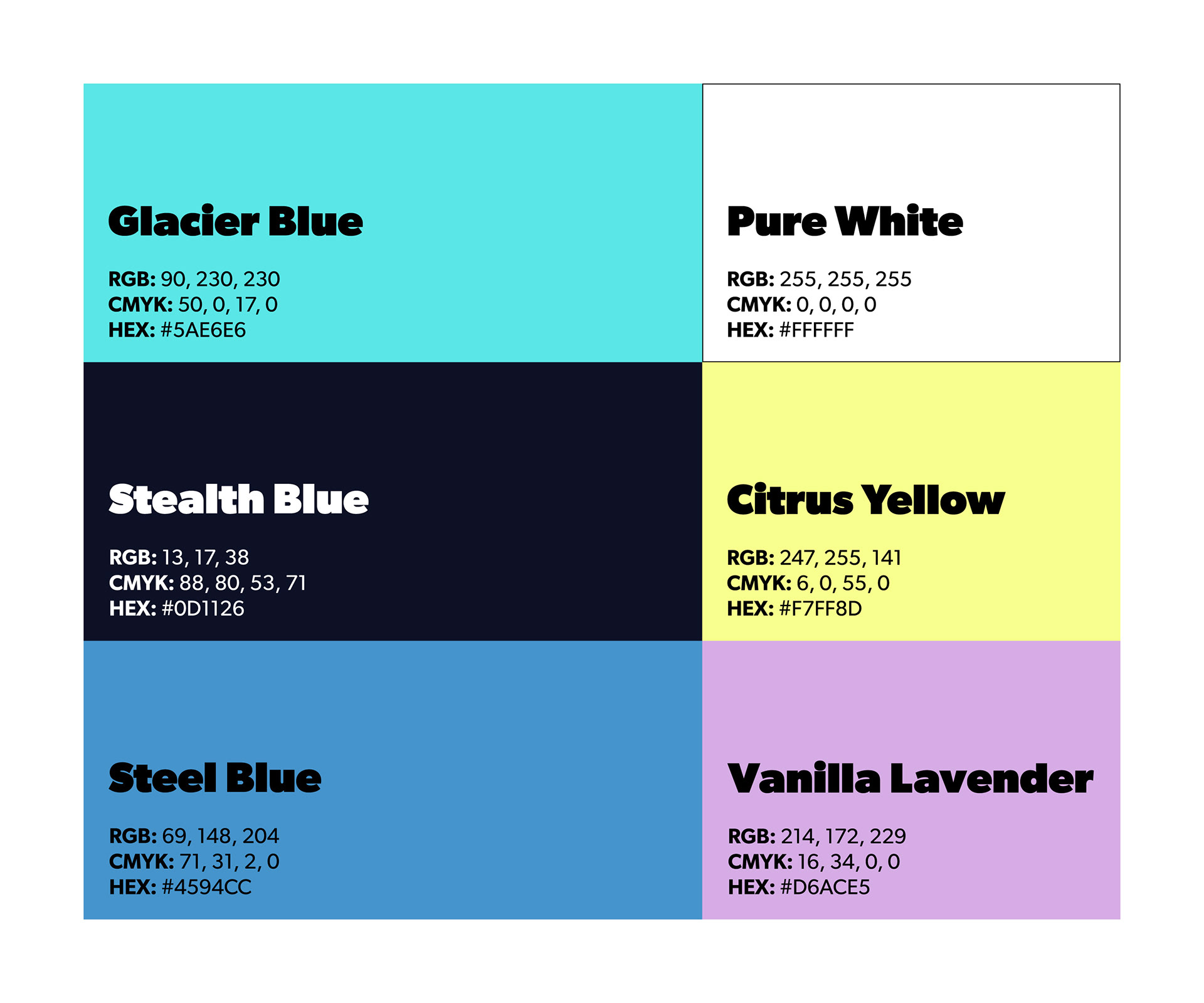
The color palette consists mostly of blues to lean towards masculinity while also highlighting the cleaning aspect. The dark blue and light blue easily contrast each other, and the middle blue works as an accent for either.
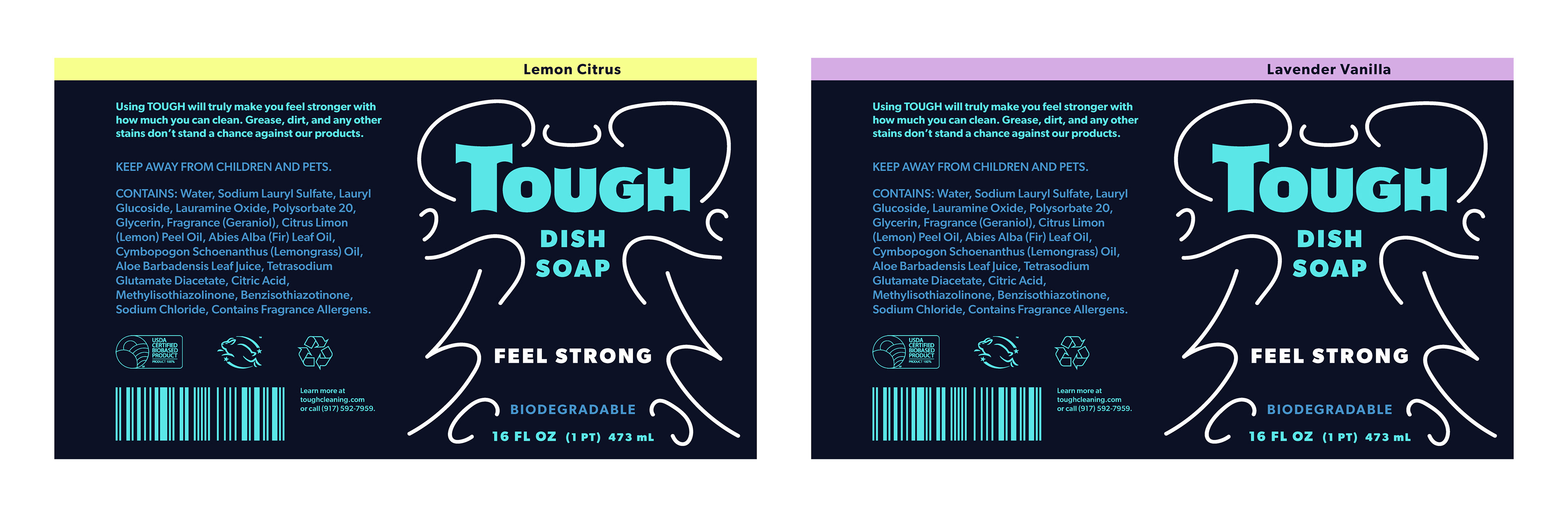
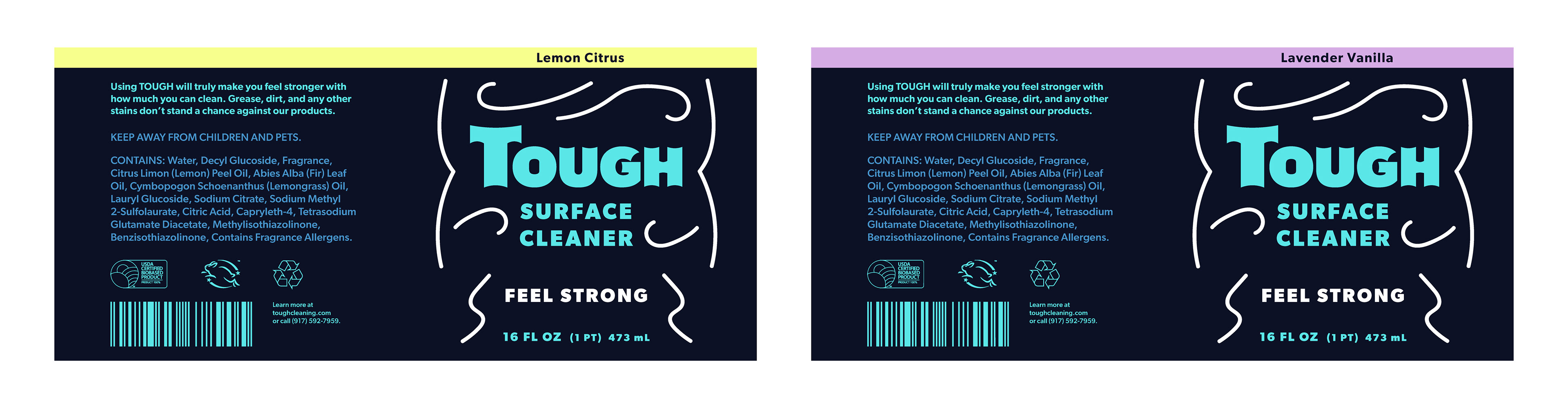
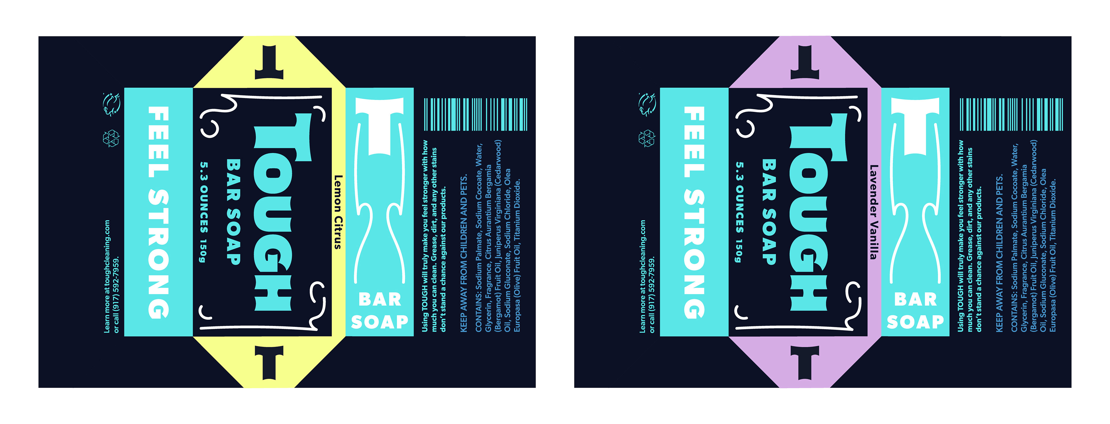
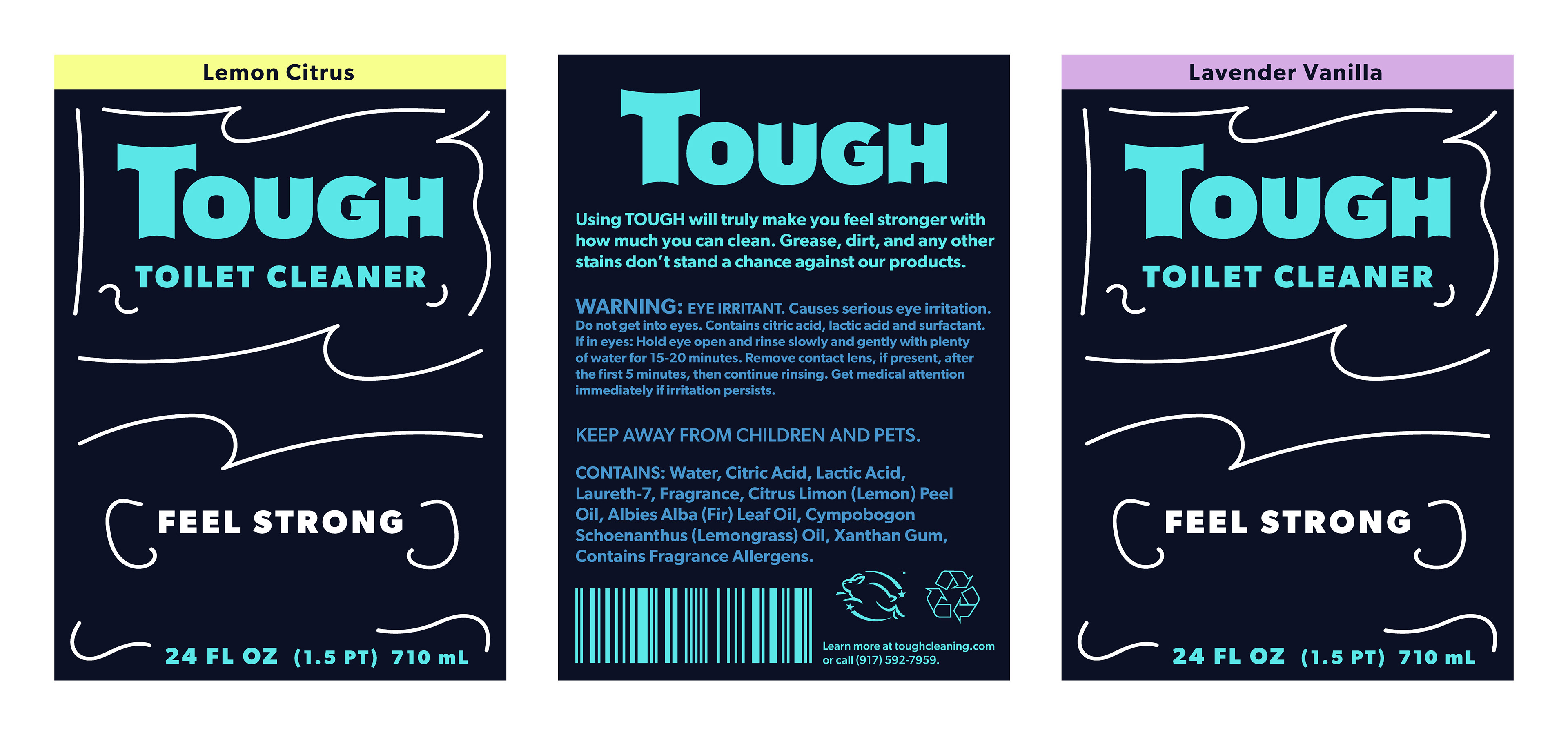
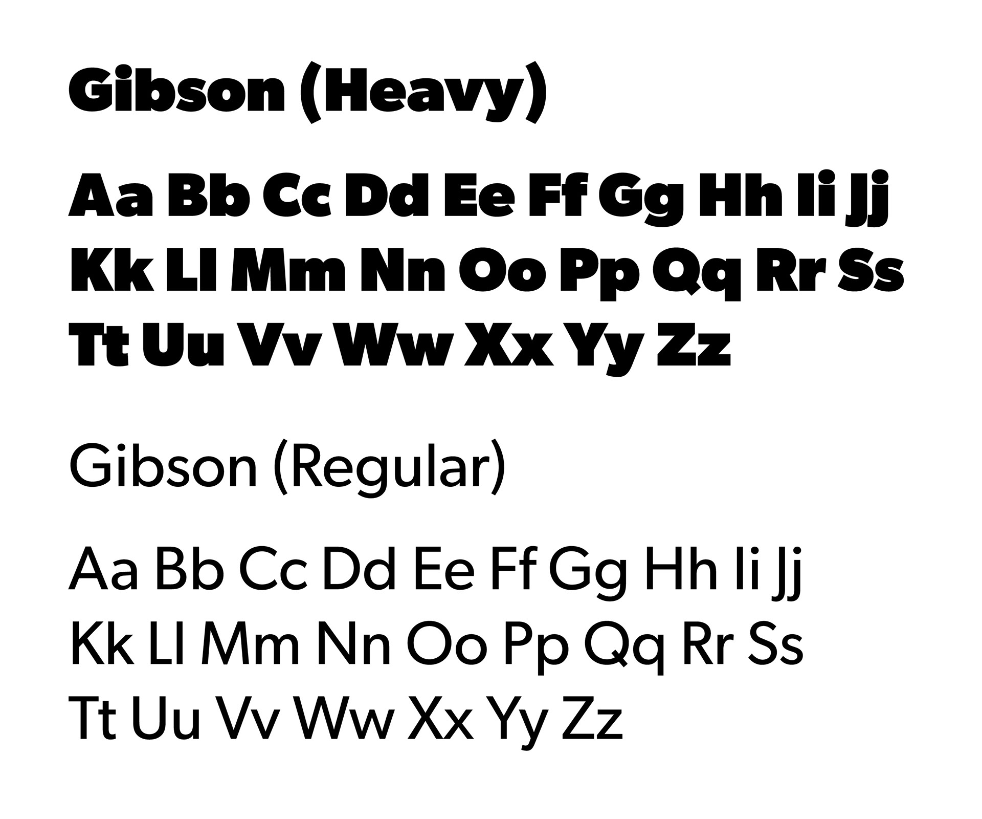
The curvy lines are simple decorations without being too distracting from the main messaging, in order to enhance the logo and what the product actually is. The fonts are straightforward and serious, getting right to what the cleaning products are for and everything you need to know.