
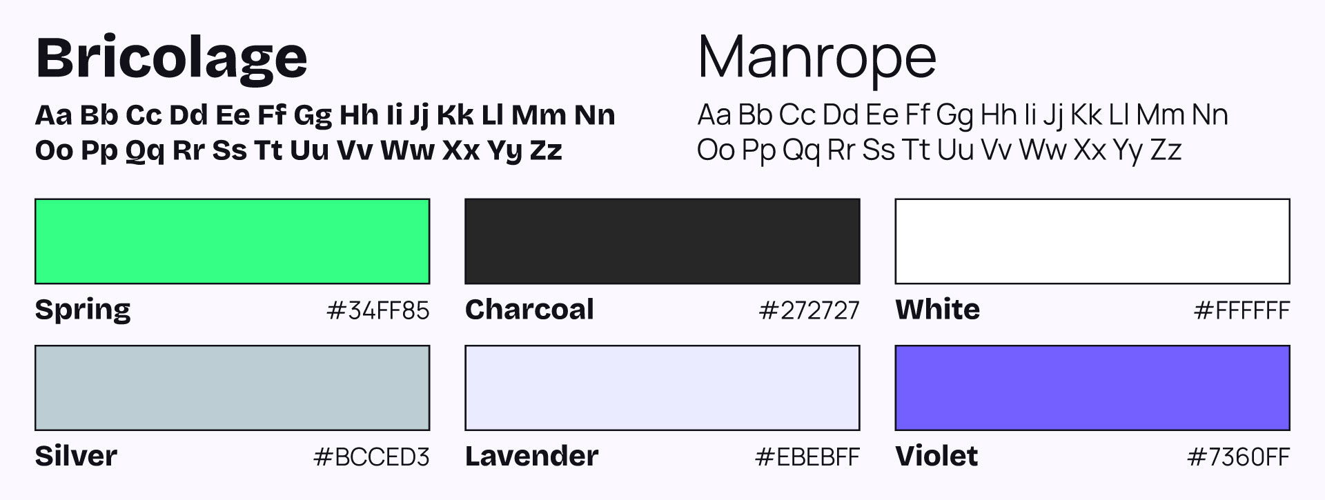
Blackthorn
Deliverables: Motion Graphics, Product Illustrations
Tools: After Effects, Figma
Year: 2025-26
Branding: Kyla Paolucci
Motion Graphics: Andy Ramsaran
Product Illustrations: Kyla Paolucci, Andy Ramsaran
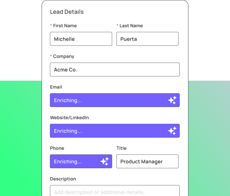
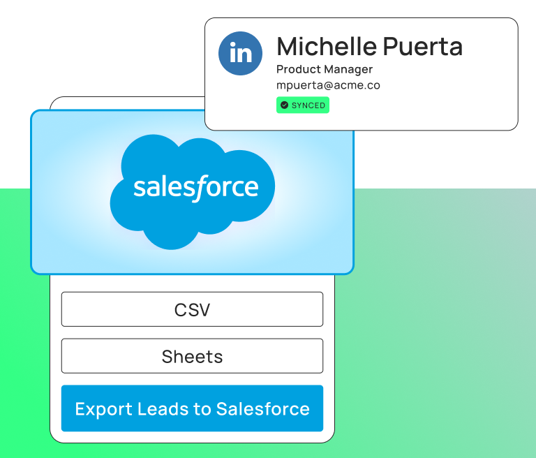
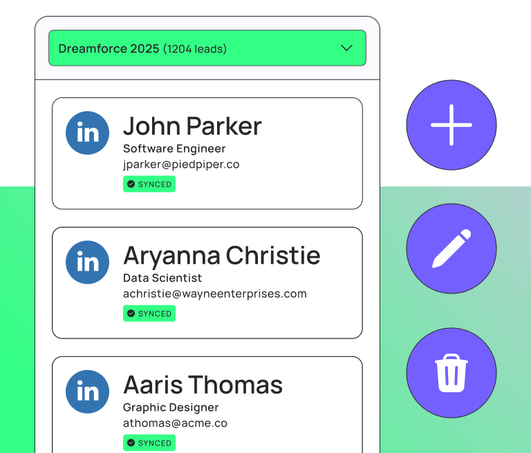
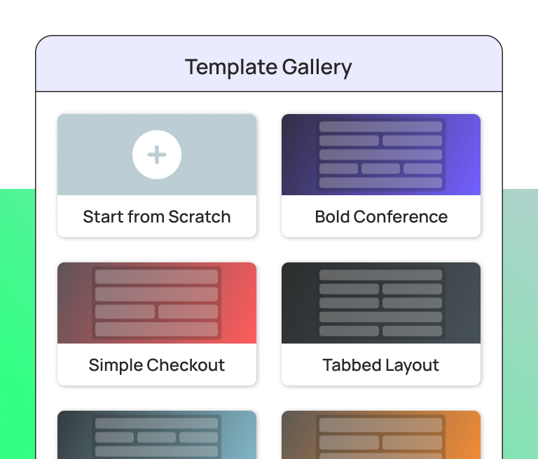
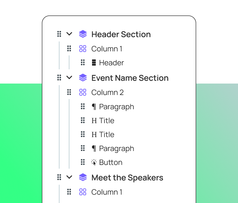
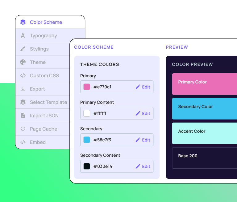
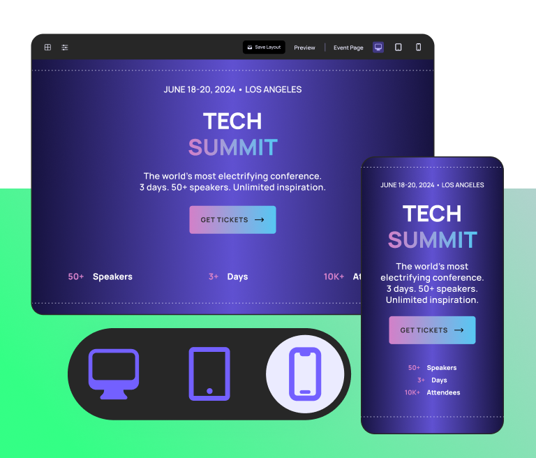
Blackthorn is an event management platform built for Salesforce, and their rebrand leaned into the titular flower with a bolder palette and a sharper identity.
My work covered sizzle reels showcasing the platform in action, and product illustrations for new feature launches.
Somehow, every project with them has also coincided with me getting sick. Must be a blackthorn allergy.


Interested in working together? Let's talk.