
Fusion
Deliverables:
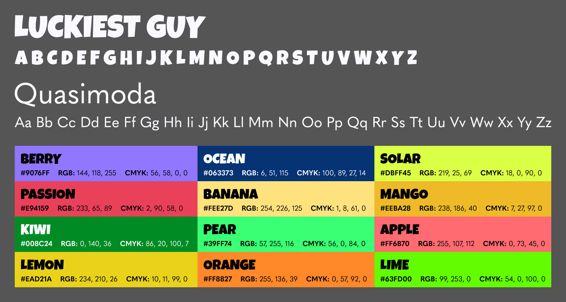
Product Design, Brand Identity
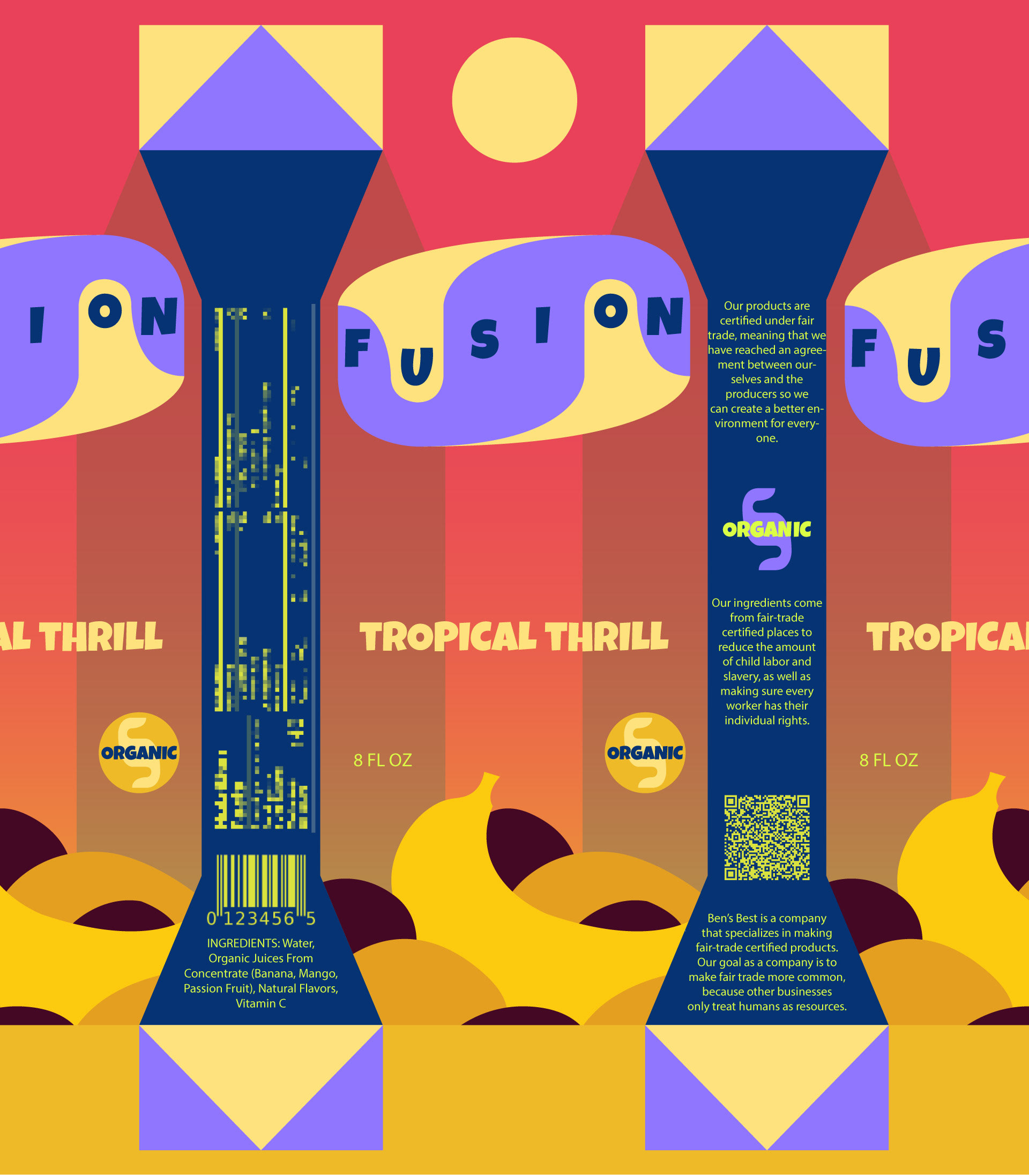
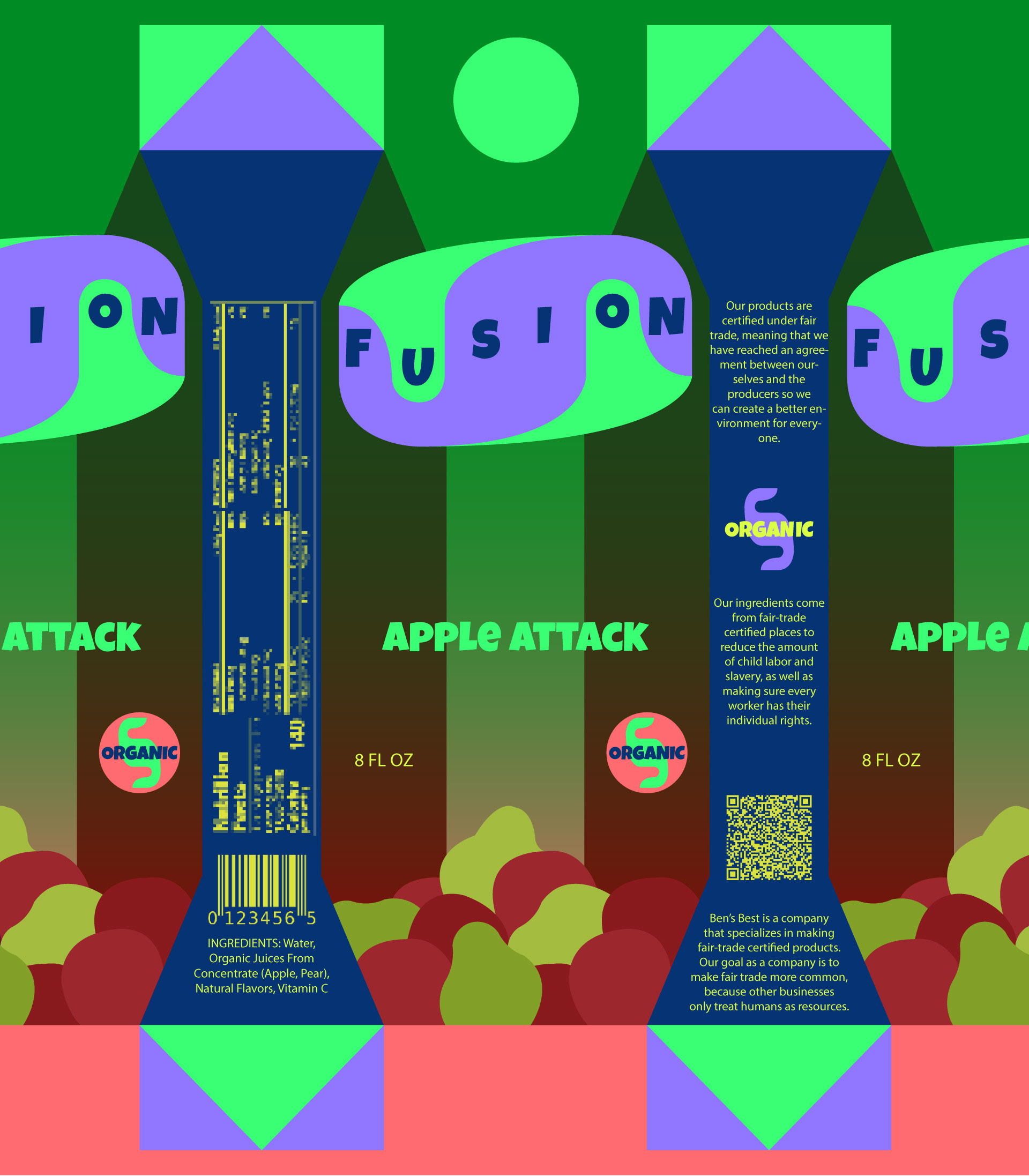
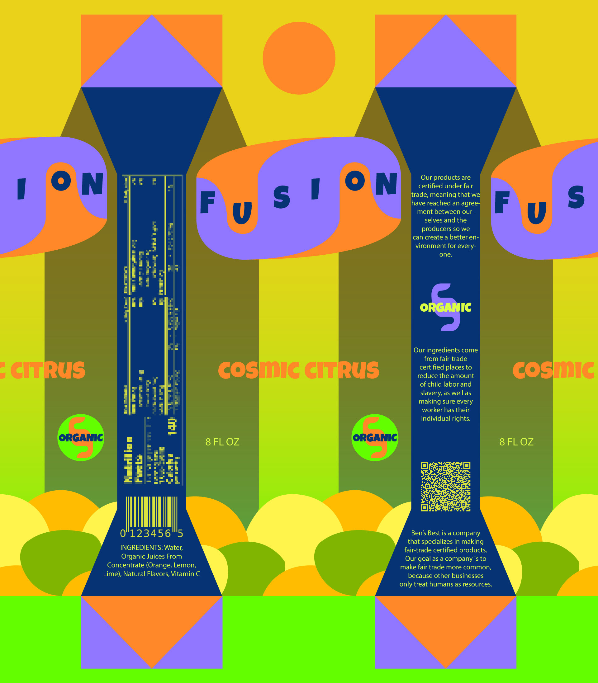
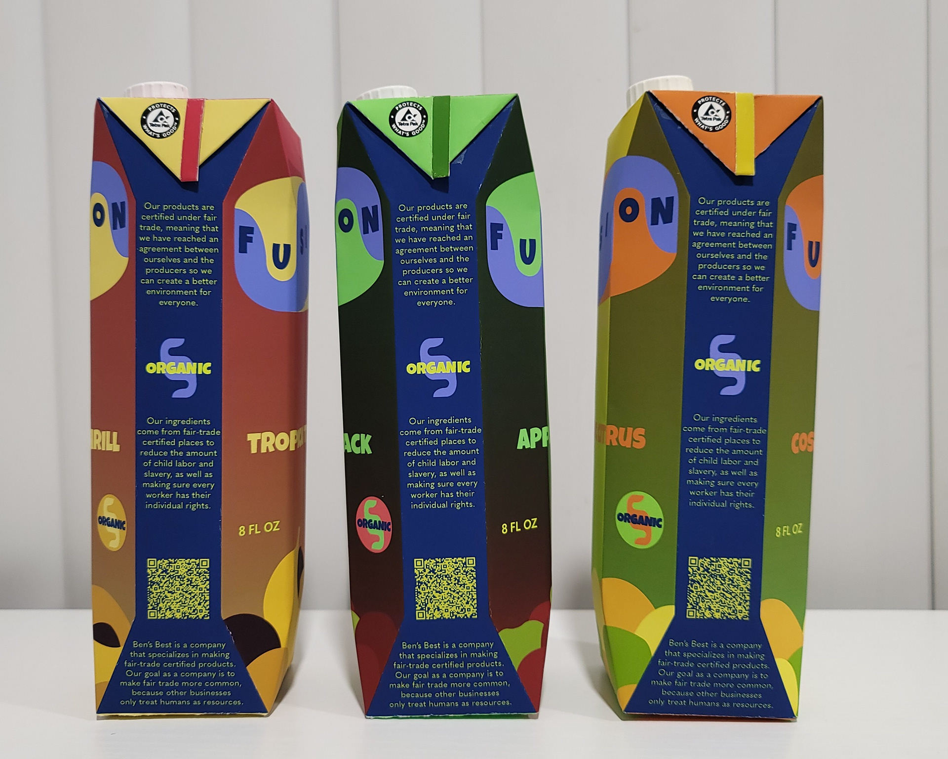
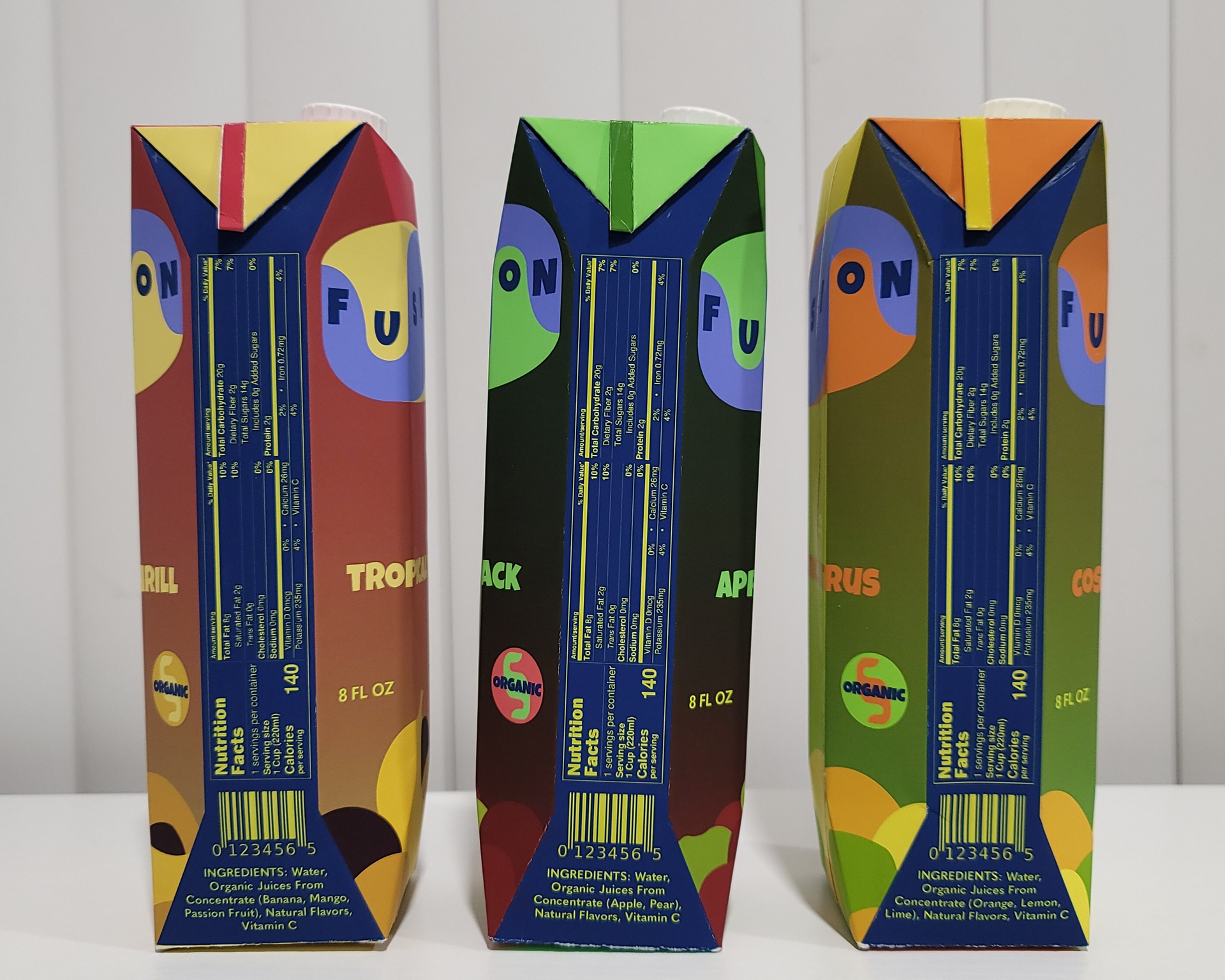
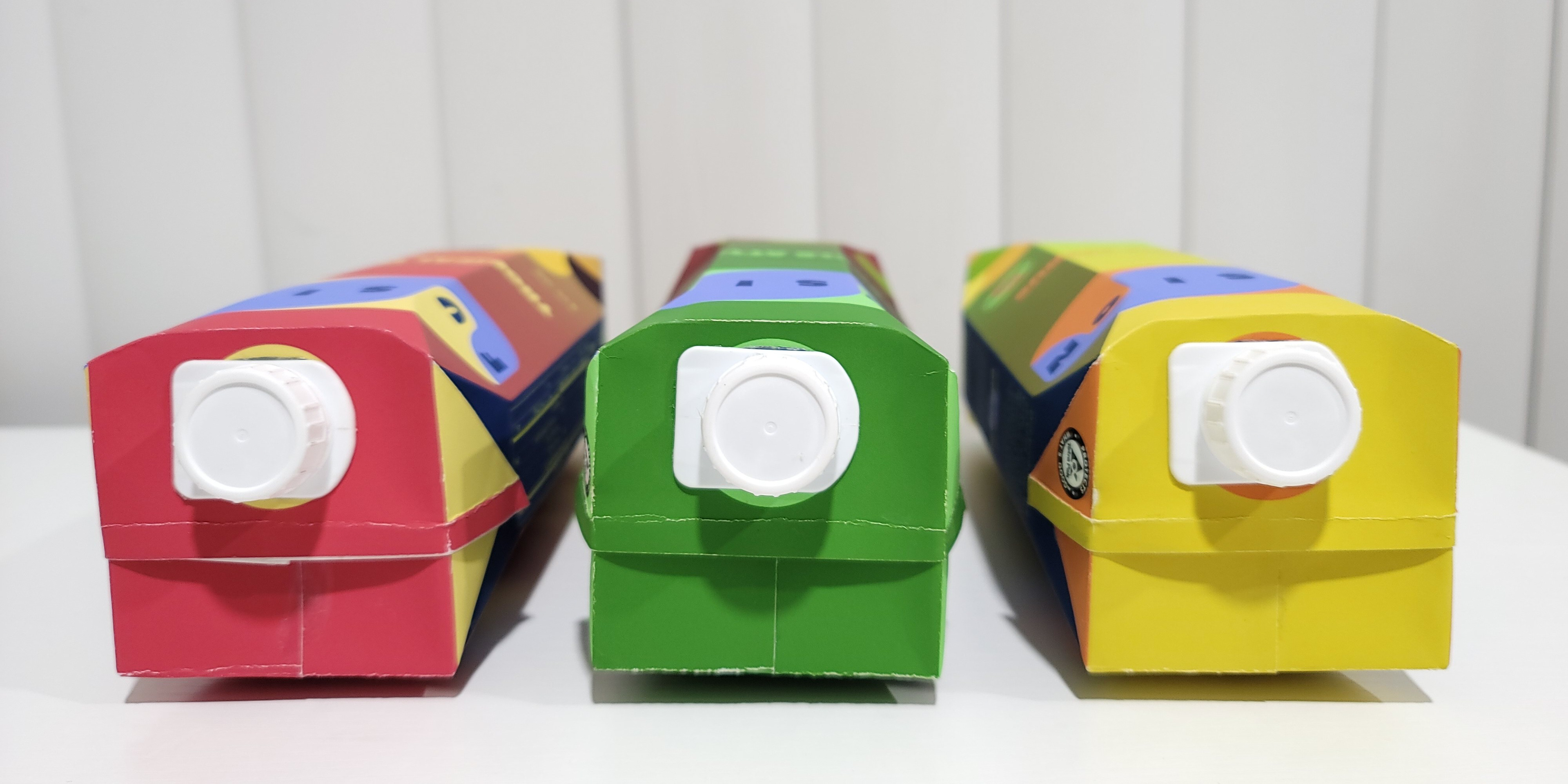
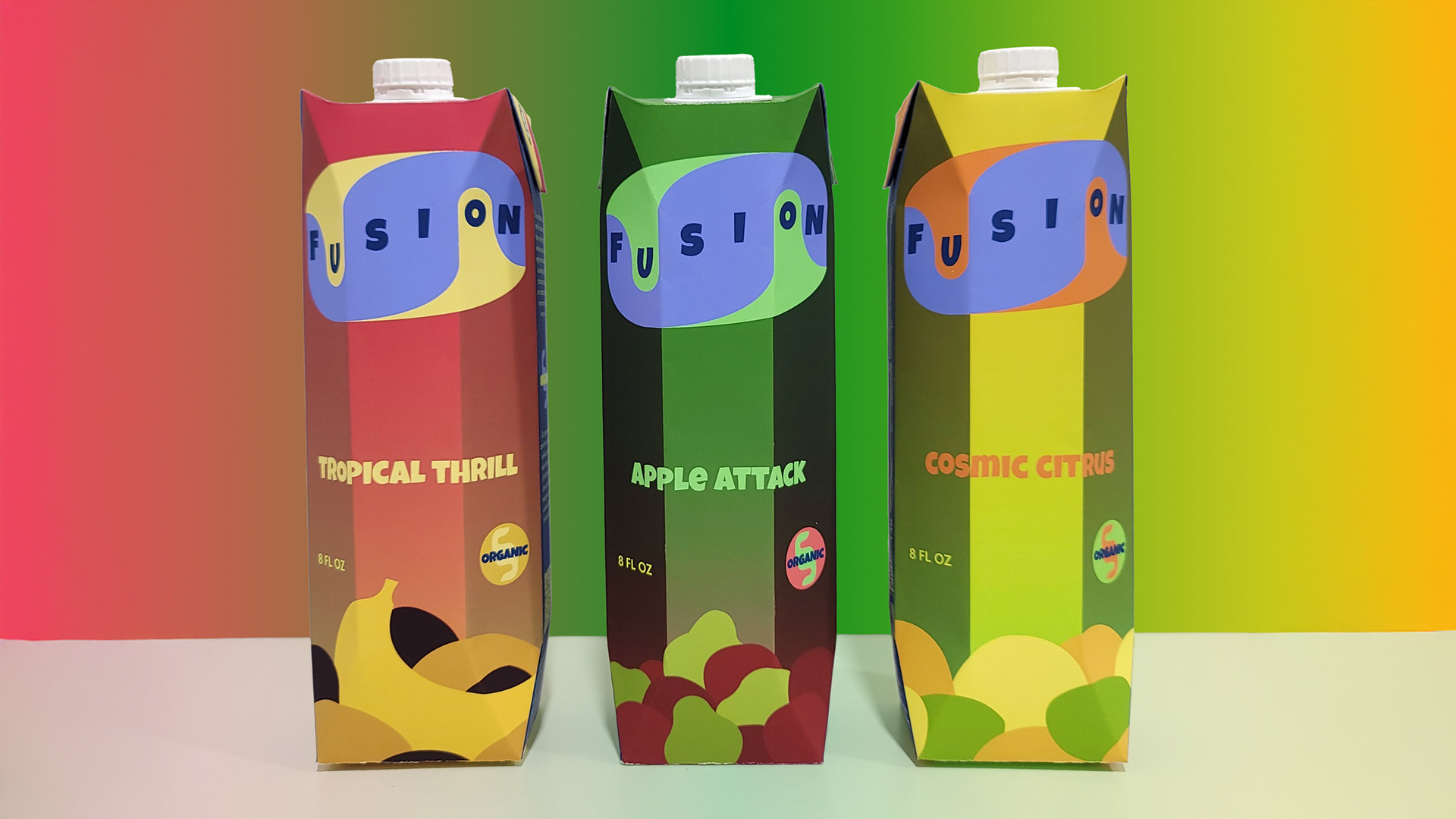
Fusion is a brand of fruit drinks targeted towards kids, designed in tetra pak packaging to reinforce fair trade and social responsibility at a young age.
Each flavor gives a unique taste based on mixing different fruits together, and the gradients of each color palette ensure that every drink looks distinct while belonging in the same family.
Each flavor gives a unique taste based on mixing different fruits together, and the gradients of each color palette ensure that every drink looks distinct while belonging in the same family.