

Good News!
Deliverables:
Editorial Design, Typography
Programs:
Illustrator
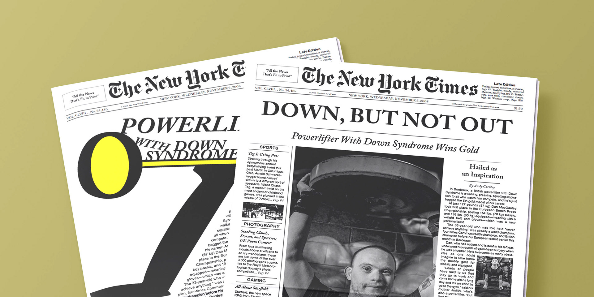
The vast majority of the news focuses on the negatives to rile people up and get the most clicks, but these newspapers pick out good stories instead to be more positive.
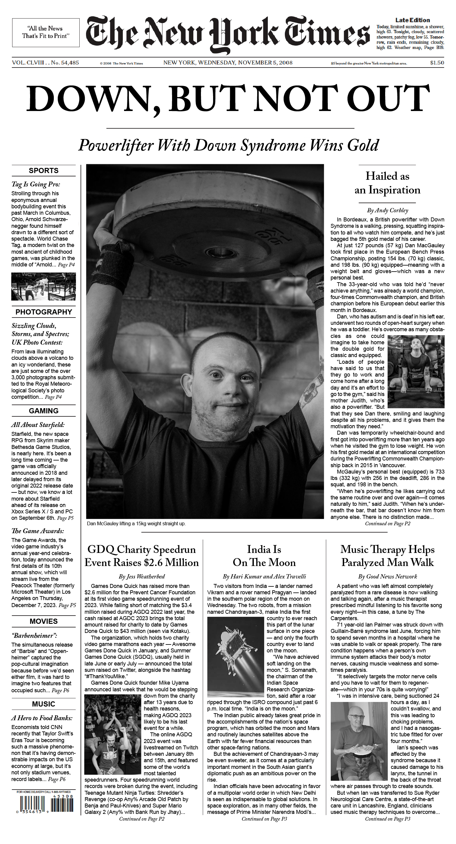
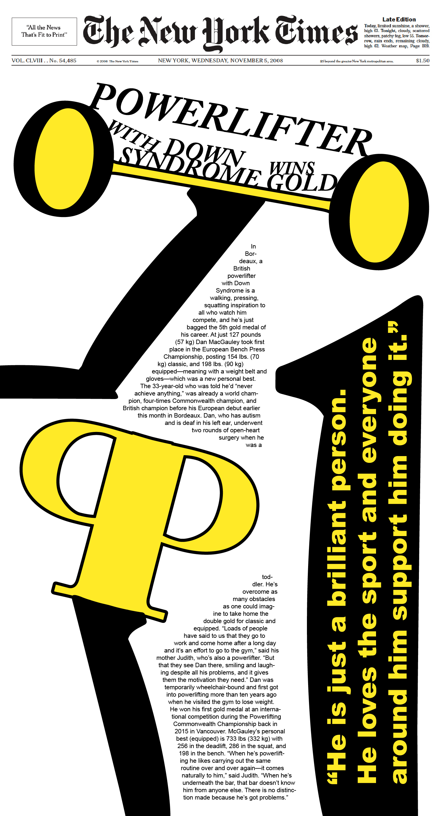
The goal was to look as accurate to a newspaper as possible, so many typographic decisions were made as a result. Indents were chosen over pushing the paragraph down to save space, and it was important to have consistency with the font size and organization.
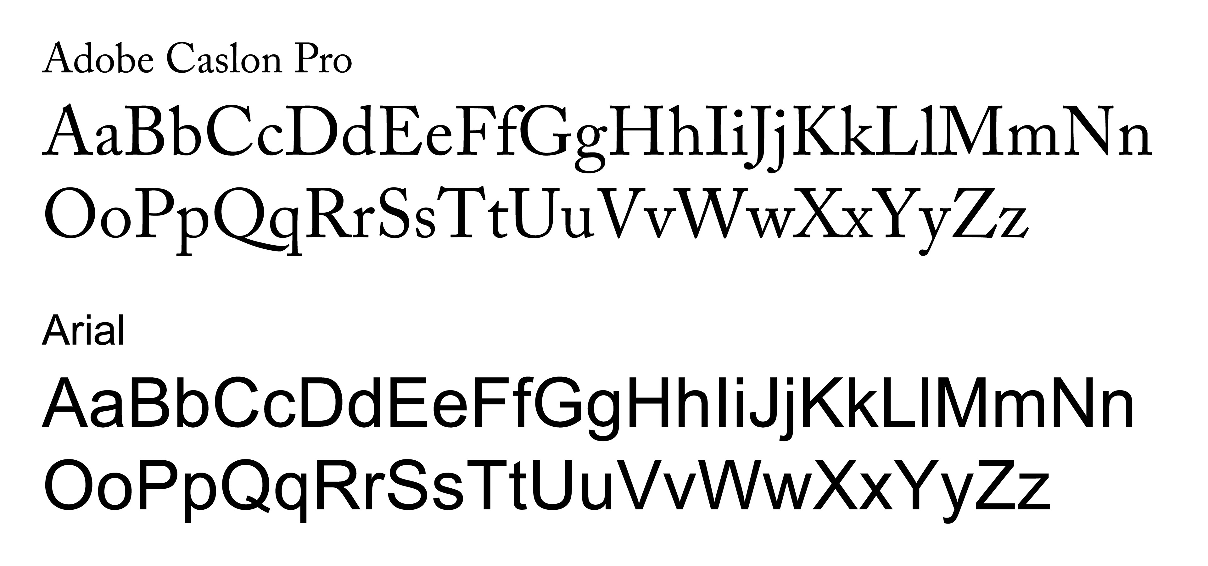
Adobe Caslon was chosen as the defacto font for headers and titles, while Arial was a common and simple font to use for the body text. Italics and bolding was essential to add hierarchy and make the text stand out.