

Diapixel / Blump
Deliverables:
Type Design
Programs:
GLYPHS, Fontstruct, Illustrator
Two typefaces were created from scratch, ensuring that they can actually be read and used as proper fonts.
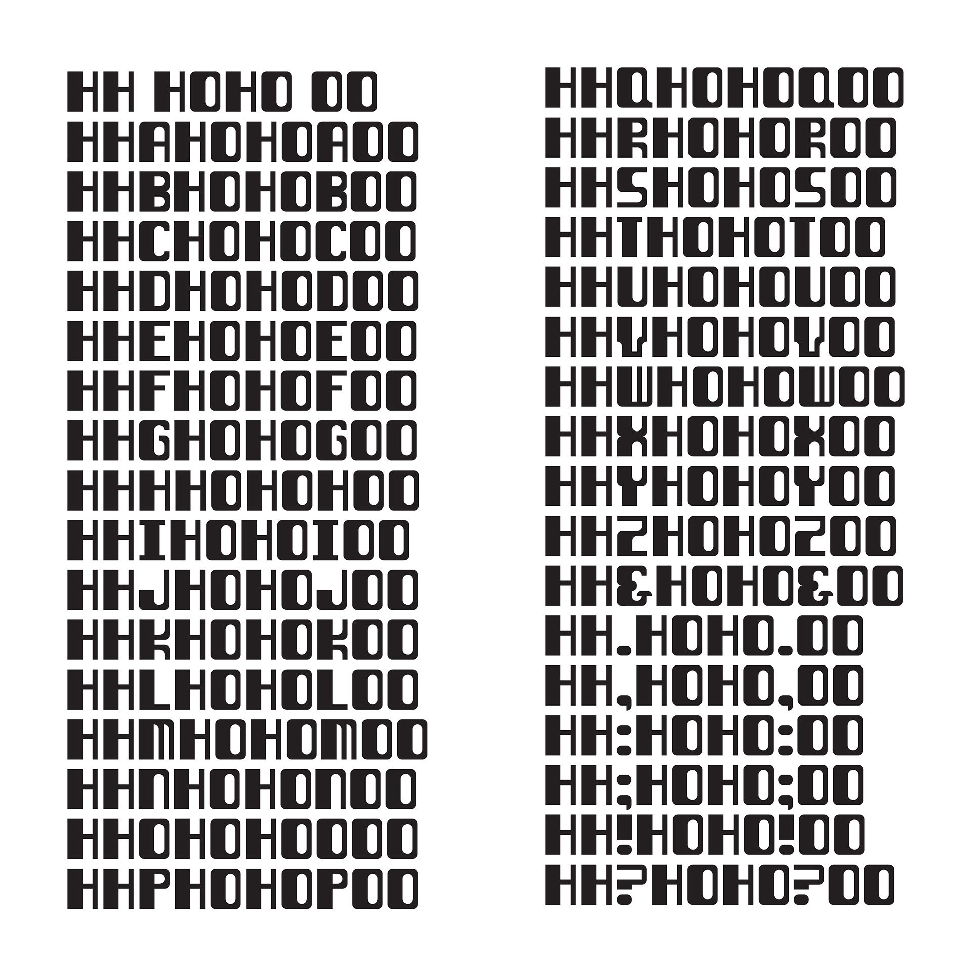
Most pixel fonts struggle with readability, especially when the pixel dimensions are too small. Diapixel's goal is to solve this problem for a 4x5 pixel font called Kroeger by using diagonal lines to connect the pixels together and thus make it easier to distinguish the letterforms.
The diagonal lines were purposefully placed to not mess with the pixel aesthetic, while also enhancing the letterform to be more readable. Only one diagonal line was allowed next to each other to keep the pixel structure, using the Kroeger font as the base for the diagonals.
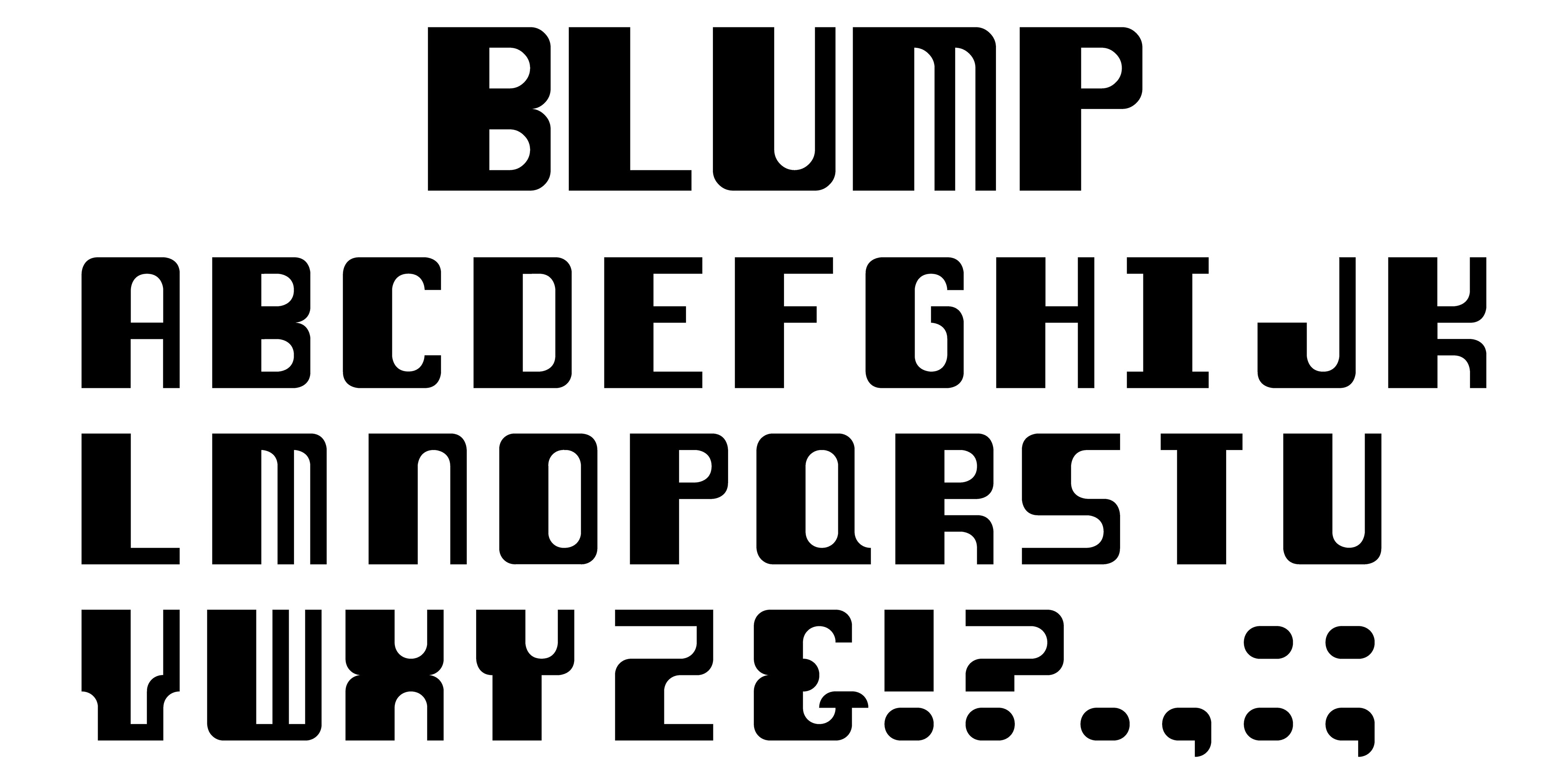
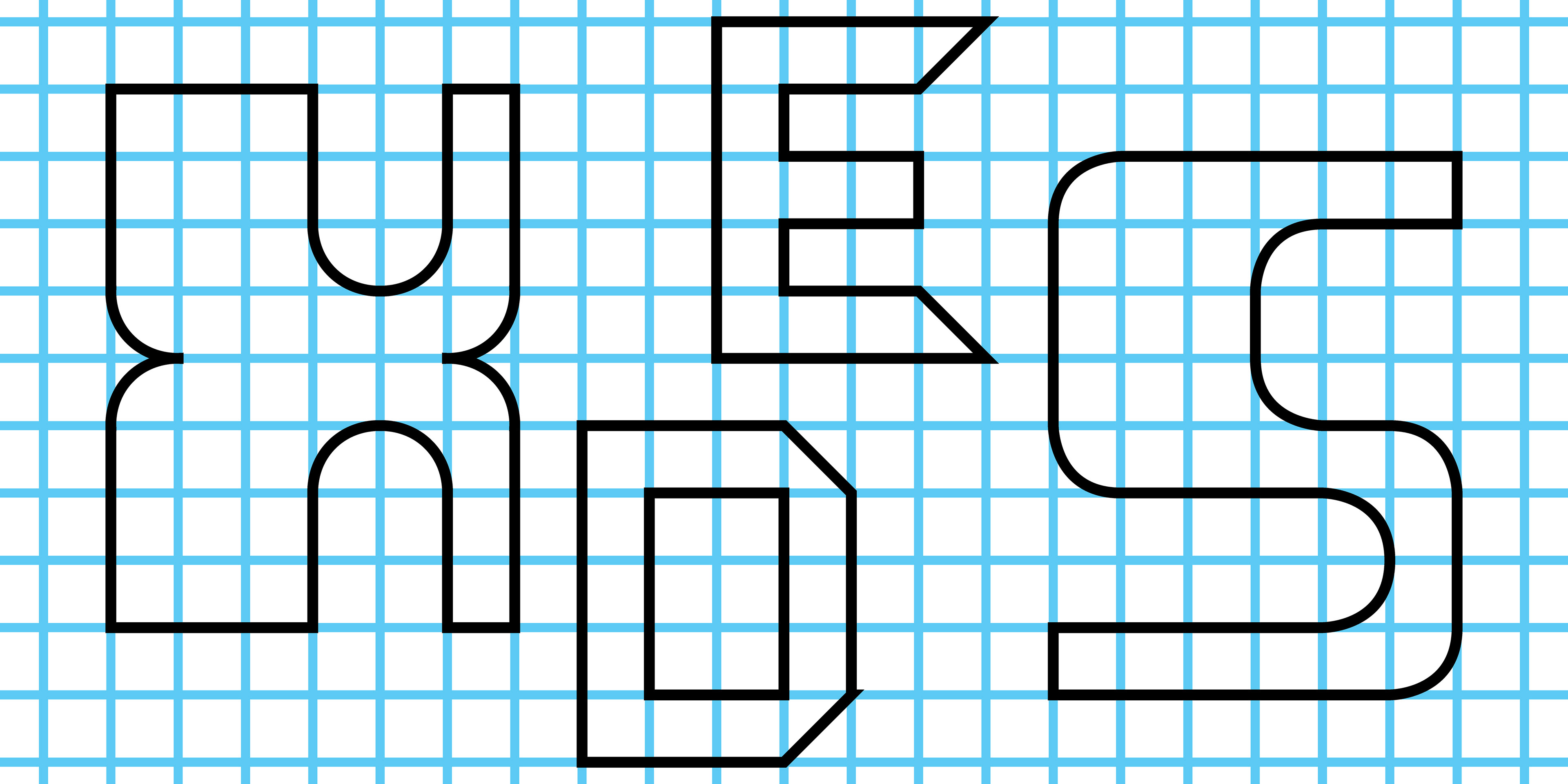
The idea with Blump was to create the letterforms where one side of letter would be much thicker, and thinner lines would bend around and connect to form the rest of it.

After designing Blump, it turned out looking like older computer fonts, so I leaned further into that direction. The letterforms were built with the choice of taking up the entire left half, and then stretching out the lines to fill out the rest of the letter.