DADA Manifesto
Deliverables:
Editorial Design, Typography
Programs:
InDesign
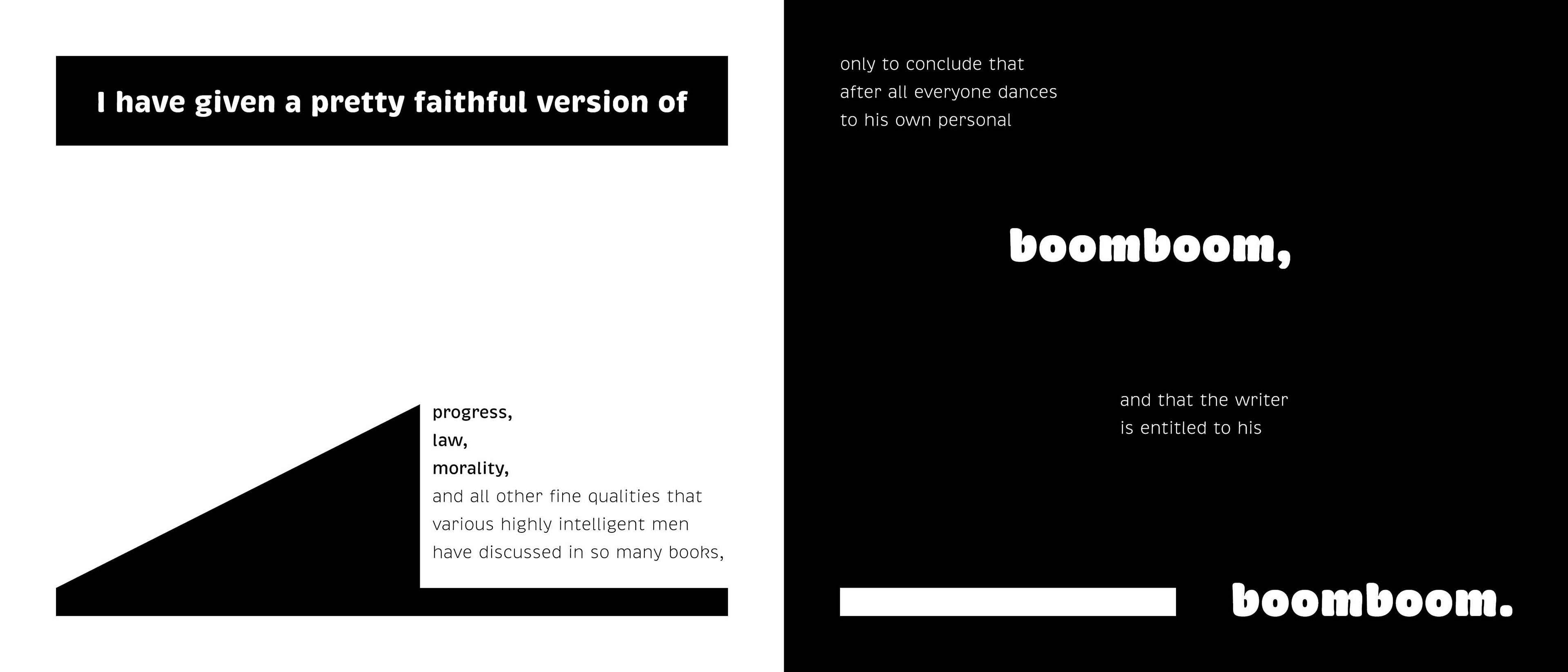
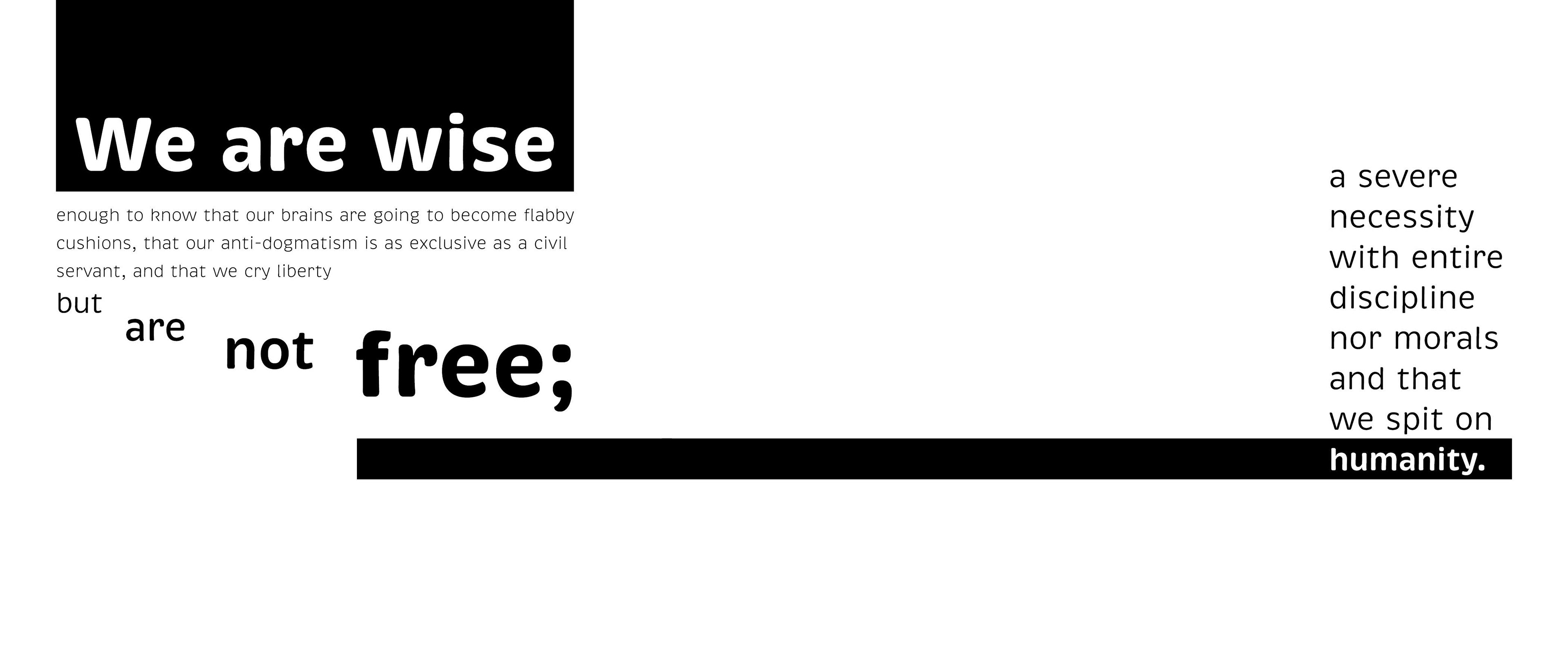
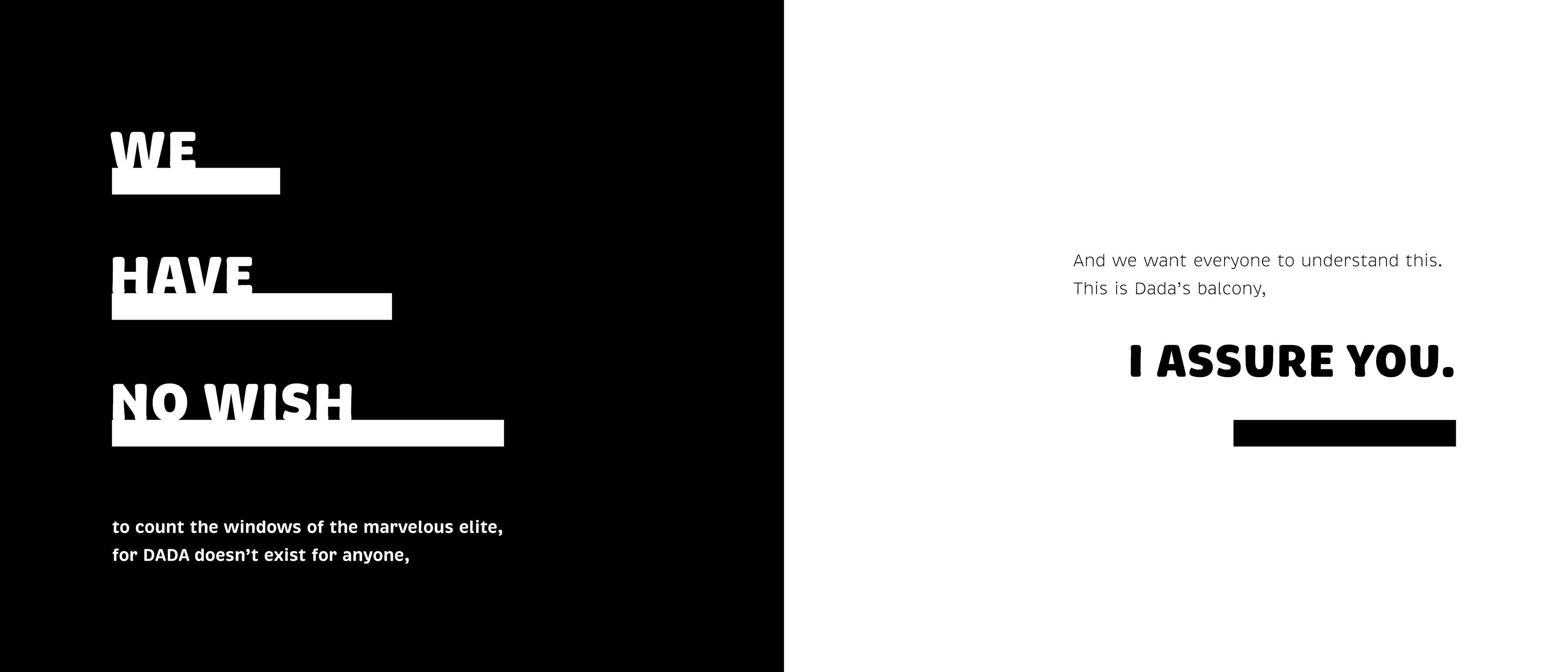
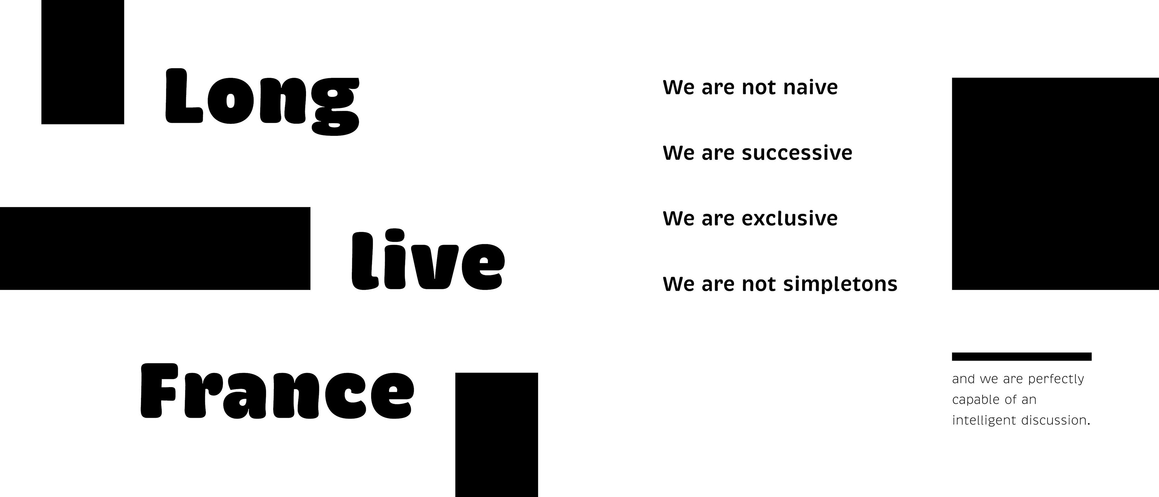
This book uses the text from Tristan Tzara's DADA Manifesto and expresses the typography in many ways using rules, boxes, and sizing.
The goal was to do something different with each page and test as many ideas as possible. Because of this, many shapes and lines were created to frame the text and create hierarchy.
Being entirely in black and white meant that the elements themselves had to do a lot of the talking to really stand out. The font Brevia is already quite expressive and bubbly on it's own, so the sharp edges of the boxes and lines contrasted nicely.


